Animation Evaluation
Task 1
Task 2
|
|
|
Task 3
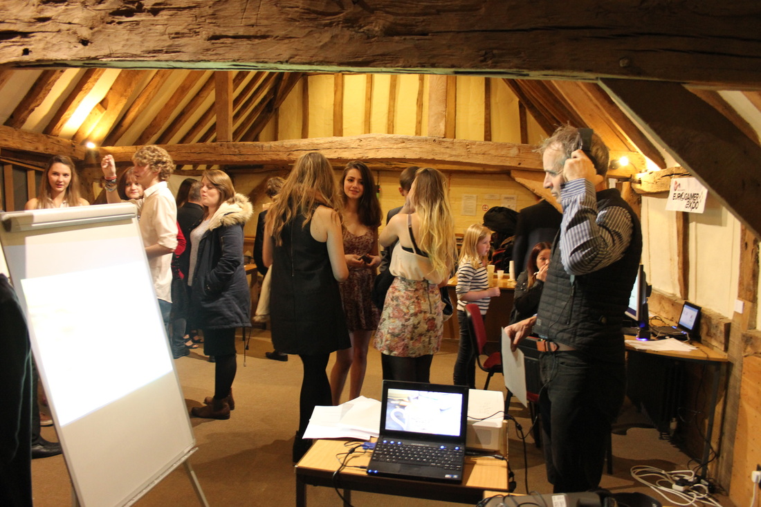
There were several people walking around the exhibition and Harry, Andy and I created a focus group out of a small group of the visitors. We asked them to talk about the animations while we took notes of their discussion.
- “It’s very interesting the way they've done this” (referring to the sets and characters made of card)
- “The animations flowed very smoothly”
- “I enjoyed that very much”
- “The sound effects in this one [my Zakman animation] are really good.”
- “Quality could be a bit better I suppose”
- “Oh, I remember playing this”
- “Looks like the real thing”
Task 4
1) - Youtube reviews
2) Feedback on improvements
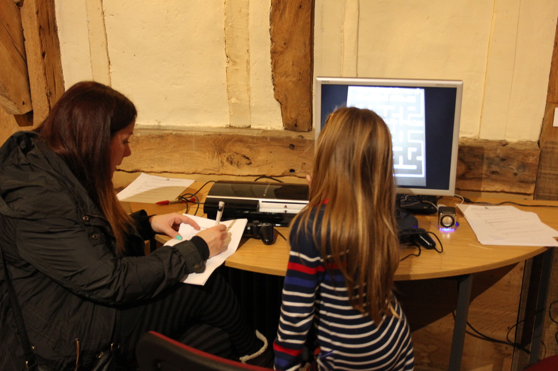
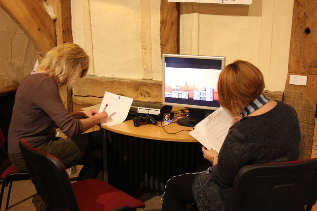
For some extra feedback I asked some of my friends and family to discuss their opinions of my animation and if they would change anything about it.
a) Lengthen the video by about 20 seconds. (1F)
b) Reduce camera movement. (2M, 1F)
c) Don't change a thing! (3M, 5F)
d) Make the background parallel to the camera lens. (2M)
e) Improve the lighting. (1M, 1F)
a) Lengthen the video by about 20 seconds. (1F)
b) Reduce camera movement. (2M, 1F)
c) Don't change a thing! (3M, 5F)
d) Make the background parallel to the camera lens. (2M)
e) Improve the lighting. (1M, 1F)
Task 5
1) feedback analysis
Overview
As you can see from task 4, I was able to ask 8 females and 8 males about my animation. The sample of people I spoke to were variously aged. Overall, most people (three males and five females) said they wouldn't have changed the animation in any way, but some pieces of constructive criticism were provided:
Lengthen the video
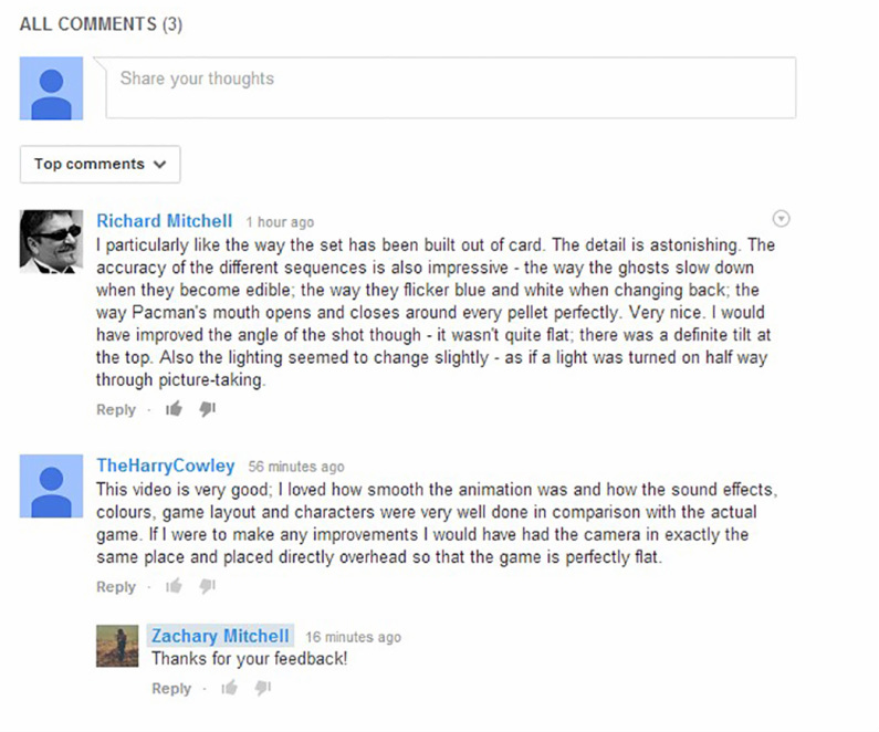
One female respondent said that the video seemed quite fast and suggested that I lengthen it by about 20 seconds. I watched the animation while playing a game of Pacman at the same time, and the animation was indeed a little faster than the original game – so this is a good point.
Reduce camera movement
Two males and one female said that I could have reduced the amount the camera moved between each shot – and this is something I wish could have been better as well. Sadly I tried my best but this was something I couldn't control perfectly. I laid down masking tape in an ‘X’ to mark the position of my tripod legs, but the actual camera itself would move as I took each photo because I didn't have a remote shutter – I plan to invest in one of these to avoid this occurring in the future.
Make the background parallel to the camera lens
Two males from my sample said they would have preferred the animation if it had been perfectly plat (parallel to the camera lens), but this was something I wouldn't change. I like the way the perspective of the shot makes it appear to be 3D – almost as if the viewer is playing the game on an old arcade machine. I think instead of altering the perspective to make it flat, I could have made this more obvious by putting a frame reminiscent of an arcade machine around the set’s edges.
Improve the lighting
One male and one female said the lighting could be better. This I absolutely agree with – I wanted to improve my lighting but at that time I didn't have any proper lighting rigs – only household lamps. For this reason the lighting is slightly yellow. Also, halfway through the production the lighting suddenly changes as if another light has been turned on – this is in fact where the animation ran over the course of two days and I was doing the photos of the second half slightly earlier than I did the first half the previous day – so the ambient lighting was slightly brighter.
As you can see from task 4, I was able to ask 8 females and 8 males about my animation. The sample of people I spoke to were variously aged. Overall, most people (three males and five females) said they wouldn't have changed the animation in any way, but some pieces of constructive criticism were provided:
Lengthen the video
One female respondent said that the video seemed quite fast and suggested that I lengthen it by about 20 seconds. I watched the animation while playing a game of Pacman at the same time, and the animation was indeed a little faster than the original game – so this is a good point.
Reduce camera movement
Two males and one female said that I could have reduced the amount the camera moved between each shot – and this is something I wish could have been better as well. Sadly I tried my best but this was something I couldn't control perfectly. I laid down masking tape in an ‘X’ to mark the position of my tripod legs, but the actual camera itself would move as I took each photo because I didn't have a remote shutter – I plan to invest in one of these to avoid this occurring in the future.
Make the background parallel to the camera lens
Two males from my sample said they would have preferred the animation if it had been perfectly plat (parallel to the camera lens), but this was something I wouldn't change. I like the way the perspective of the shot makes it appear to be 3D – almost as if the viewer is playing the game on an old arcade machine. I think instead of altering the perspective to make it flat, I could have made this more obvious by putting a frame reminiscent of an arcade machine around the set’s edges.
Improve the lighting
One male and one female said the lighting could be better. This I absolutely agree with – I wanted to improve my lighting but at that time I didn't have any proper lighting rigs – only household lamps. For this reason the lighting is slightly yellow. Also, halfway through the production the lighting suddenly changes as if another light has been turned on – this is in fact where the animation ran over the course of two days and I was doing the photos of the second half slightly earlier than I did the first half the previous day – so the ambient lighting was slightly brighter.
2) Bar chart showing feedback from task 4

Task 6
Over the course of this unit I've looked at many different animations, taken inspiration from some and learnt from others. I feel like my animation is quite a creative one in terms of the storyline, but in terms of technical production it’s quite similar to other videos. Let’s look at a few other animations now:
The Little Red Plane:
Although I love the animation techniques of this animation – the mixture of CGI and stop motion – it’s not very similar to my animation at all. The knitted objects are 3D, while my card cut-outs are 2D. The background moves around as if the camera is moving, while mine remains fixed. However, there is a beginning, middle and end to the storyline – it’s not just random – which is similar to my animation.
Construction Paper:
Construction Paper:
This video is more similar to mine than The Little Red Plane – because it’s 2D stop motion animation of a card set and cut-outs. The difference is there seems to be someone manipulating the objects in this video worked into the animation – his movements control what happens on the screen like he’s pressing a touch screen computer. Although I initially considered having a person (a game-player) in my animation, I eventually decided against it because I like the 2D look of my animation, and to include a person would mean taking up their time as well as mine (the person would have two hands in the frame, so I wouldn’t have been able to take the photos!). Also I can imagine it would have been very difficult not to move too much between frames – I would have to keep referring back to the last frame before I could be sure that everything was positioned correctly in my next shot. Something which is different about this animation to my own is the background - it moves around like the one in The Little Red Plane, although in 2D rather than 3D. Also, the storyline of this production is completely random - unlike the storyline for my animation which has a clear beginning, middle and end.
